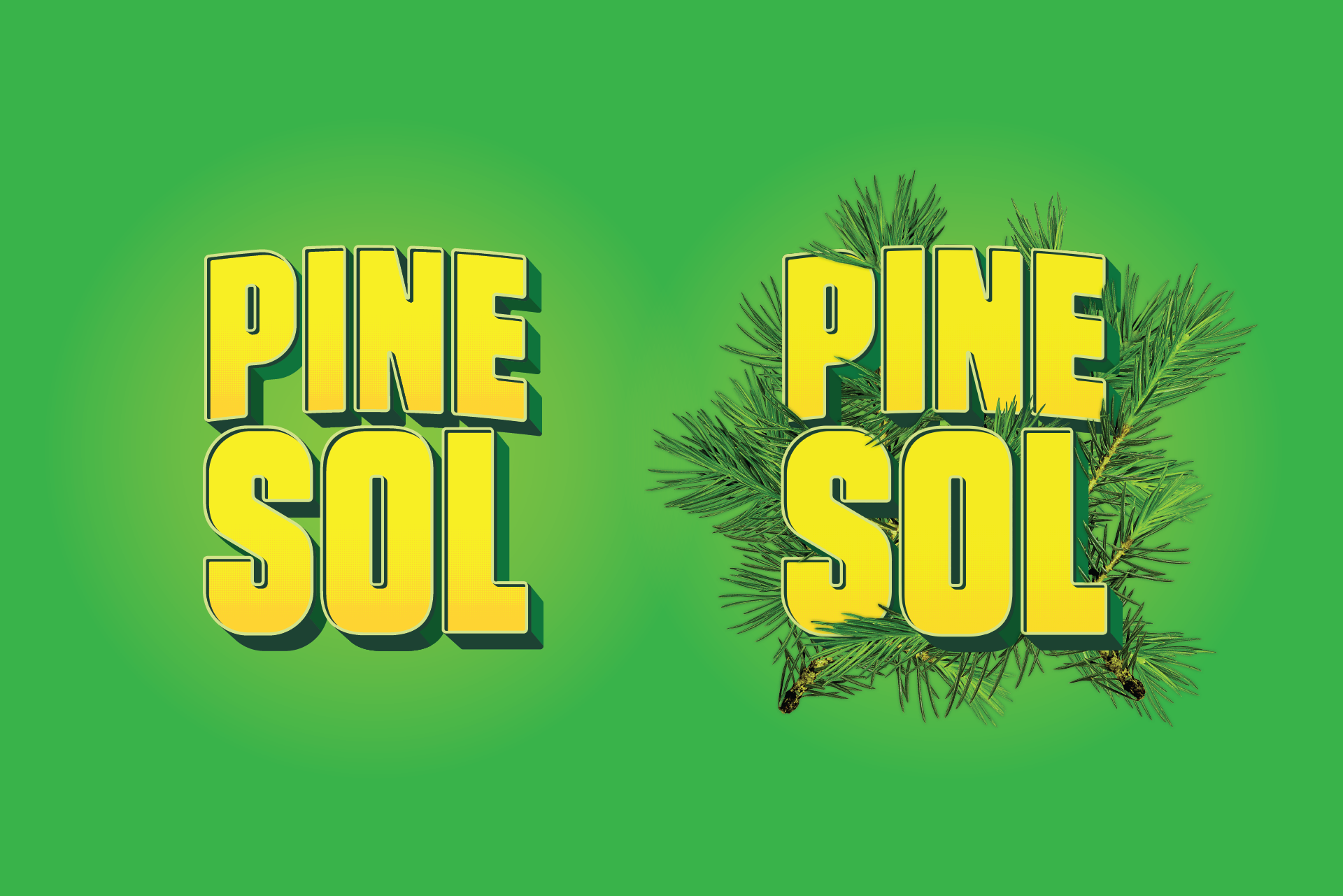
Pine-Sol has always been a powerful cleaner, but we needed the brand to represent more than cleaning. Picking up a bottle of Pine-Sol should be a statement in itself. This started with the logo.
This new Pine-Sol logo combines brand heritage and American history to propel the brand into the future. It uses techniques and craftsmanship from sign painting to leverage and evolve aspects of the previous logos to make them work harder. The classic Pine-Sol outline is still a central unifying element to the mark as a trustworthy container. We use depth to make the mark sturdier and, combined with the sign painter’s style, it feels timeless and honest. The horizontal motion of the previous mark is translated into a vertical motion, giving the mark a broad-shouldered confidence and ambition. This logo is dynamic, authentic, has heart, and an all- American grit.